Thursday, 21 November 2013
Saturday, 16 November 2013
TASK 8 - Photography
These are just some of the images I took for my magazine. I will take more photos and blog them soon.
Wednesday, 13 November 2013
Rough Ideas/ Sketches of my Magazine...
Here is a rough idea of what the 3 pages of my magazine will look like. I tried to improve these pages by using the feedbacks I was given by my classmates, which I have incorporated on these sketches. However, this is not the final idea I will have for each page, so these could be changed for the real magazine.
Thursday, 7 November 2013
Learing to use Adobe Illustrator...
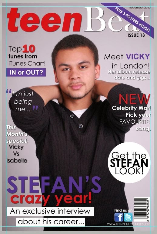
Here I learnt how to use Adobe Illustrator and how I could manipulate certain fonts and texts into the way I want them to be. Whilst I was playing around with some of the tools on Adobe Illustrator, I found that this program was specifically made to edit vector graphic images or fonts etc so I thought it was ideal to use this program for my music magazine cover. Like I mentioned in my Prezi, 'Teen Vogue' inspired me for my front cover because I really like the layout of it, as well as the colour schemes that were used on some magazines.
The colour scheme of this magazine really inspired me. I did mention on my Prezi that my colour scheme could be changed so red, white, purple and black is my final chosen colour scheme. The masthead font temporarily could be the one above but that could change too. What I like about my masthead is that the fonts are bold and readable, therefore the reader will be able to recognise the brands name. Also, my masthead is similar to 'Teen Vogue' masthead because I want my magazine to look as professional as 'Teen Vogue'. I do know that 'Teen Vogue' is a fashion magazine and that I'm doing a music magazine but I like the layout and colour scheme of it, therefore I will use some of these ideas for my magazine.
Wednesday, 6 November 2013
TASK 7 - Audience Research
Here is my presentation of my Prezi and some of the rough ideas I will use for Teen Beat. The feedback I was given from the audience were generally positive and I will put into consideration all the ideas and thoughts I was given into my magazine.
Things to include for my magazine would be to add Twitter and Facebook logos so that my target audience can find more about Teen Beat. Like I mentioned in this video, our generation is always on the internet, therefore it would be really useful to include these logos on Teen Beat. Also, because my target audience is for a very young age group, I will include freebies like posters, concert tickets or maybe CD's which will manipulate the audience to buy my magazine. I will make sure I have both male and female posters because I've got a mixed audience.
I might consider making this magazine for only a female audience as there are many magazines that are for male readers.
Subscribe to:
Comments (Atom)


