Thursday, 16 January 2014

Question 4 - Evaluation 3

Here are a few images about my readers profile. These are only some of the things teenagers (females mainly) like to do or look up to. For example, Justin Bieber is one of the most famous and idolised celebrities that many male and female teenagers look up to. His Pop, Teen Pop and R&B genre music is loved by many young adults all around the world, including myself as I am also part of the target audience. TV shows are also another thing that teenagers love to watch. My favourites are The Vampire Diaries, The Originals and The Tomorrow People. Fashion is also a very important element for teenagers, as they like to follow new trends. The most common places for teenage girls to go to shopping is New Look and River Island because these stores are most suitable for our sense of style. As a teen myself, I love my electronic devices, they tend to be with me all the time because it is my main source of entertainment. I also have a lot of music on my phone, which is another reason why I keep it close to me. My music is my way of getting into my own world and trying to forget about all my worries for a while, thus the reason why I love my phone, which is also similar for other teenagers as well.
Sunday, 22 December 2013
TASK 10 - Audience Research/ Music Magazine Evaluation
Front Cover - Strengths
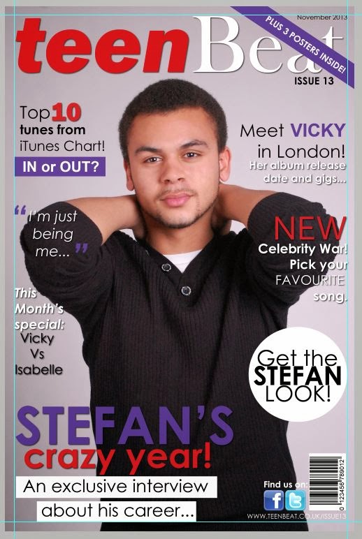
I’ve received many comments/ feedbacks stating that my front cover was a success, as it looked very professional. They’ve specifically mentioned how the use of my colour scheme has really given the sense of it being a pop music magazine. I was also told that the red and the purple went really well together because they contrasted really well, which also proves that I followed the conventions of making a successful magazine cover. Furthermore, my target audience really liked my house style choice because it fit well with the colour scheme. They liked the consistency of the same font being used with just different effects of each cover line because it was an original idea, and not many magazines use only one font throughout the whole magazine, whereas mine did. My masthead was bold, interesting and eye catching for teenagers, which also appealed to them because it was a brand that really related to them (as they enjoy listening to pop music and because they are teenagers). Seeing as though my target audiences were teenagers, I thought why not use ‘Teen’ as part of my brands name. The ‘Beat’ would also remind you of the beat of pop music, which again is a catchy phrase to use. Moreover, my image is very strong and very powerful because my cover stars facial expression clearly illustrates how serious he is about his career, even though he’s just a teenager. My target audience really liked how my main cover line is the largest thing on the page, because they were aware that this is what the newest issue of this magazine will mainly be focused on. My front cover on my first draft/ plans wasn’t going to have a really big cover line, which was something that I had changed. I thought it would look more interesting with the massive cover line on the front page because it would get a lot of attention. I was also going to have more cover lines but then I though it would’ve been too much therefore I didn’t include them. Also, the use of splashes made my front cover look more realistic and looked similar to Teen Vogues front cover, as I was inspired by that magazine. They particularly enjoyed seeing how I used my cover lines to highlight specific things differently, like the ‘NEW’ and the ‘Top 10 tunes’ because it made my cover look more interesting. Lastly, I thought that making the cover star look straight at the camera would be very useful because it could be seen as if the model is inviting the teenage audience to take a look at the magazine. I don’t think there is anything I would consider as a weakness for my front cover, neither does my target audience.
Contents Page - Strengths
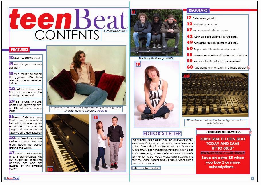
For my contents page, I received comments saying how my colour scheme was consistent, the red and purple contrasted really well. I used a variety of images on the contents page to prove that I can make my page look as professional and real like existing magazine contents pages. For my first draft/ plans, my contents page was going to be a single page because I didn’t have the subscription box, the regulars or the editors letter, but then I thought the more information I put on these pages the better and more professional it would look. Furthermore, my target audience really liked the fact that I included an Editors Letter because it gave them like a little summary of the new things this issue had inside. Also, the subscription box informs them about the sales Teen Beat offers once they have subscribed, which is another element they liked. The fact that my Regulars and Features were laid out separately also illustrates how organized it looked because there wouldn’t be any confusion between the two. Moreover, the reason why I made my masthead big and bold was because it really catches the attention of the audience, as it’s nearly taking up half of the page. I’m also promoting my brands name by doing this. Other comments I received also mentioned that the target audience really liked how my page numbers were really big and attractive because of the style of the font and because of the colours red and purple I used, they also gave the whole pop genre hint on the contents page. As for the captions I used underneath some of the images, they really helped to clear up some of the reasons why I put some of those images on the contents page, which was very useful.
Weaknesses
I believe that there are a lot of weaknesses on my contents page, as I didn’t like the layout of it at all. I thought everything was just placed randomly on the page, which didn’t really look professional. If I was to recreate my contents page, I would defiantly make sure that I include a background colour/ effect because I think that it will make that page look a lot more interesting than what it looks like now. For example, I was thinking that I could make a background effect that fades/ vanishes away because it could signify that the music teenagers listen to could make them feel as if they want to fade away into their own worlds, as if their trying to escape from reality into their own dreams. I could perhaps make the Features and the Regulars fit into a box, which could make it look more organized. I was also thinking that I could make some of the images have a black and white effect, so that it could be a contrast to the other images. In addition, if it was really necessary/ important I could add a cover story, possibly to talk more about the cover star.
DPS – Strengths
My double page spread was another interesting and successful page in my opinion. Teenagers loved the way that my model looked very comfortable but serious at the same time, they mentioned how it was a powerful image that really stood out. They loved the language I used as it portrayed them in a way. The colour scheme again was consistent which looked professional. One comment really stood out for me “All the features you have used show that your genre is Pop, as your use of language and the stars you have used reflects this.” I really liked this feedback as it proved that my double page spread was good and that it clearly stated the genre using the colour scheme. Some also liked the way I used a drop cap in the beginning of the interview, which was another important element for a successful page of journalism I included. I particularly liked the way I illustrated the title ‘Vicky’s new career’ because it looked very feminine as the star itself was a female and the fact that I used purple for it also adds to this. I also thought the colour scheme went well with what my model was wearing because again, this gives the hint of the pop music genre and that my magazine is aimed at a young teenage audience. Clearly, my double page spread was a success because everyone liked the way I laid out my work and how I presented it to my target audience. If I were to recreate this page I’d just maybe add a little bit more about the idol or add more to the interview because it did seem a little too short for me but other than that, it looked very professional and unique.
Tuesday, 10 December 2013




Thursday, 21 November 2013


Saturday, 16 November 2013
TASK 8 - Photography


These are just some of the images I took for my magazine. I will take more photos and blog them soon.
Wednesday, 13 November 2013
Rough Ideas/ Sketches of my Magazine...


Here is a rough idea of what the 3 pages of my magazine will look like. I tried to improve these pages by using the feedbacks I was given by my classmates, which I have incorporated on these sketches. However, this is not the final idea I will have for each page, so these could be changed for the real magazine.
Thursday, 7 November 2013
Learing to use Adobe Illustrator...

Here I learnt how to use Adobe Illustrator and how I could manipulate certain fonts and texts into the way I want them to be. Whilst I was playing around with some of the tools on Adobe Illustrator, I found that this program was specifically made to edit vector graphic images or fonts etc so I thought it was ideal to use this program for my music magazine cover. Like I mentioned in my Prezi, 'Teen Vogue' inspired me for my front cover because I really like the layout of it, as well as the colour schemes that were used on some magazines.

The colour scheme of this magazine really inspired me. I did mention on my Prezi that my colour scheme could be changed so red, white, purple and black is my final chosen colour scheme. The masthead font temporarily could be the one above but that could change too. What I like about my masthead is that the fonts are bold and readable, therefore the reader will be able to recognise the brands name. Also, my masthead is similar to 'Teen Vogue' masthead because I want my magazine to look as professional as 'Teen Vogue'. I do know that 'Teen Vogue' is a fashion magazine and that I'm doing a music magazine but I like the layout and colour scheme of it, therefore I will use some of these ideas for my magazine.
Wednesday, 6 November 2013
TASK 7 - Audience Research
Here is my presentation of my Prezi and some of the rough ideas I will use for Teen Beat. The feedback I was given from the audience were generally positive and I will put into consideration all the ideas and thoughts I was given into my magazine.
Things to include for my magazine would be to add Twitter and Facebook logos so that my target audience can find more about Teen Beat. Like I mentioned in this video, our generation is always on the internet, therefore it would be really useful to include these logos on Teen Beat. Also, because my target audience is for a very young age group, I will include freebies like posters, concert tickets or maybe CD's which will manipulate the audience to buy my magazine. I will make sure I have both male and female posters because I've got a mixed audience.
I might consider making this magazine for only a female audience as there are many magazines that are for male readers.
Monday, 21 October 2013
TASK 6 - Magazine Proposal: Prezi
I have done some research for a suitable magazine publisher for Teen Beat, and I have found that IPC Media is actually a good publisher because they have published magazines before like NME Magazine. NME is also a very known magazine in the UK, therefore IPC Media is a suitable publisher for my magazine.
Subscribe to:
Posts (Atom)